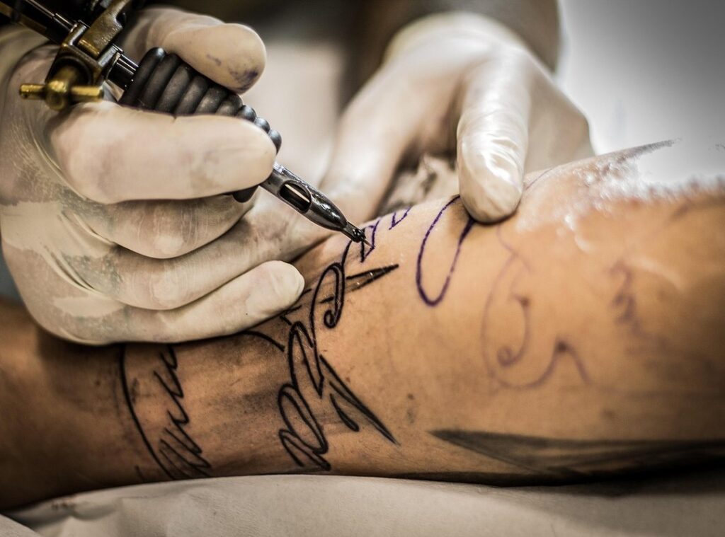
I’ve seen a lot of tattoo enthusiasts struggle with those awkward empty spaces between larger tattoos. It’s frustrating, right? You want your sleeve or leg piece to look seamless and complete.
That’s where a gap filler patchwork tattoo flash sheet comes in. Think of it as a curated collection of small, standalone designs specifically created to fill those gaps. These little designs are the unsung heroes of a cohesive and finished look.
They help you achieve that popular aesthetic called a “patchwork sleeve” or “sticker sleeve,” where full coverage is the goal. This article is all about what makes a great gap filler, how to design them, and even some ideas for creating your own flash sheet. Trust me, these small details can make a big difference.
The Anatomy of a Perfect Gap Filler Design
When it comes to gap fillers, adaptability is key. The best designs are asymmetrical or have irregular shapes that can be squeezed, flipped, or rotated to fit unique spaces.
Think about it—how many times have you seen a perfectly symmetrical design that just doesn’t work in a tricky spot? That’s why I always recommend designs that can be adjusted.
Boldness and legibility are also crucial. Small tattoos need clean, strong lines and good contrast. Otherwise, they can turn into an unreadable ‘blob’ over time.
It’s all about making sure the design stands out, even years down the line.
Thematic consistency is another important factor. A gap filler patchwork tattoo flash sheet should either follow a clear theme, like celestial or botanical, or maintain a consistent artistic style. This ensures that the designs look cohesive and professional.
Size variation is a must. A good flash sheet offers a range of tiny, small, and medium-small designs. This way, you can tackle everything from a finger-sized gap to a palm-sized one.
Let’s talk examples. A snake, dagger, or vine can be great fillers. They’re flexible and can be adjusted to fit various spaces.
On the other hand, a perfectly circular, detailed mandala might not work as well. It’s too rigid and can’t be easily adapted.
In the end, it’s all about finding designs that are both versatile and visually appealing.
How to Design Your Own Flash Sheet: A Step-by-Step Guide
Designing your own flash sheet can be a fun and creative process. Let’s break it down into simple steps.
First, define your theme and style. Think about the visual direction you want to go in. Maybe you’re into American traditional, or perhaps fine-line minimalism is more your thing.
Even an ignorant style could be interesting. It’s all about what speaks to you.
Next, brainstorm a list of motifs. Jot down 20-30 simple symbols and objects that fit your chosen theme. For example, if you’re going for a nature theme, consider leaves, mushrooms, bees, berries, and twigs.
The key is to keep it simple and meaningful.
Now, it’s time to sketch with negative space in mind. Draw these motifs, focusing on creating shapes that flow and can be adapted. Try drawing around imaginary obstacles to practice.
This will help you get a feel for how the designs will look on different parts of the body.
Once you have your rough sketches, it’s time to refine, ink, and solidify. Clean up those initial drawings, establish bold final line work, and plan for solid black shading or a limited color palette. This step is crucial for making your designs stand out and ensuring they have maximum impact.
Finally, arrange the final sheet. Lay out the finished designs on a single page, varying their size and orientation. This creates a visually appealing and practical flash sheet for a tattoo artist to reference. Sffareboxing
Think of it as a gap filler patchwork tattoo flash sheet—something that can be used to fill in spaces or add small details to larger pieces.
By following these steps, you’ll end up with a flash sheet that not only looks great but also serves a practical purpose. Happy designing!
Popular Themes and Ideas for Your Gap Filler Flash
When it comes to choosing the perfect design for your gap filler flash, you want something that stands out yet complements your existing tattoos. Here’s a list of popular and effective themes to inspire you:
- Celestial & Cosmic: Stars, crescent moons, planets, comets, constellations, and simple UFO designs.
- Nature & Botanical: Single leaves (maple, oak), small vines, individual flowers, mushrooms, insects (moths, bees), and spiderwebs.
- American Traditional Staples: Daggers, skulls, dice, lucky horseshoes, cherries, anchors, and simple roses.
- Abstract & Geometric: Dots (dotwork), lines, chevrons, simple patterns, minimalist eye symbols, and other non-representational shapes.
- Ignorant & Doodle Style: Quirky and fun ideas like smiley faces, simple cartoon characters, lightbulbs, matches, and other everyday objects drawn in a simple style.
These themes are not just popular; they’re also versatile. For instance, celestial and cosmic designs can add a mystical touch, while nature and botanical elements bring a touch of the outdoors. American traditional staples, on the other hand, offer a classic, timeless look.
Gap filler patchwork tattoo flash sheet is a great resource to find these designs. They provide a wide range of options that can fit into any space, no matter how small or oddly shaped.
By choosing from these themes, you can ensure that your new tattoo not only looks great but also integrates seamlessly with your existing body art.
Common Mistakes to Avoid When Creating Gap Fillers
-
Overly Complex Details. I can’t stress this enough: keep it simple. If you cram too much detail into a small space, those fine lines will blur and become a mess over time.
It’s like trying to read a tiny print on a label—frustrating and pointless.
-
Sticking to Perfect Symmetry. Symmetrical designs, like perfect circles or squares, are the hardest to fit into irregular gaps. They limit your placement options and often end up looking out of place.
Trust me, a little asymmetry can go a long way in making a design look natural.
-
Ignoring the Flow of the Body. A gap filler shouldn’t just plug a hole; it should complement the surrounding tattoos. Think about how the design fits with the muscle flow of the area.
It’s like adding a piece to a puzzle—it needs to blend seamlessly.
-
Inconsistent Art Style. Mixing different styles on the same gap filler patchwork tattoo flash sheet is a big no-no. A fine-line design next to a bold traditional one can make the final patchwork look disjointed and unplanned.
Consistency is key to a cohesive look.
Avoid these mistakes, and you’ll be on your way to creating a gap filler that looks great and stands the test of time.
Bringing Your Patchwork Tattoo Vision to Life
A gap filler patchwork tattoo flash sheet is the key to transforming a collection of tattoos into a cohesive, fully realized work of art. Design for adaptability. Use bold and clean lines.
Maintain a consistent style. These principles will guide you in creating a visually stunning and harmonious tattoo design.
Start sketching your ideas. Use the themes and steps provided in the article as a guide. Always collaborate with a professional tattoo artist.
They can provide crucial feedback on which designs will work best for your specific gaps, skin, and existing tattoos.
 Randy Drummondarez has opinions about boxing news and updates. Informed ones, backed by real experience — but opinions nonetheless, and they doesn't try to disguise them as neutral observation. They thinks a lot of what gets written about Boxing News and Updates, Upcoming Fights and Events, Fighter Profiles and Statistics is either too cautious to be useful or too confident to be credible, and they's work tends to sit deliberately in the space between those two failure modes.
Reading Randy's pieces, you get the sense of someone who has thought about this stuff seriously and arrived at actual conclusions — not just collected a range of perspectives and declined to pick one. That can be uncomfortable when they lands on something you disagree with. It's also why the writing is worth engaging with. Randy isn't interested in telling people what they want to hear. They is interested in telling them what they actually thinks, with enough reasoning behind it that you can push back if you want to. That kind of intellectual honesty is rarer than it should be.
What Randy is best at is the moment when a familiar topic reveals something unexpected — when the conventional wisdom turns out to be slightly off, or when a small shift in framing changes everything. They finds those moments consistently, which is why they's work tends to generate real discussion rather than just passive agreement.
Randy Drummondarez has opinions about boxing news and updates. Informed ones, backed by real experience — but opinions nonetheless, and they doesn't try to disguise them as neutral observation. They thinks a lot of what gets written about Boxing News and Updates, Upcoming Fights and Events, Fighter Profiles and Statistics is either too cautious to be useful or too confident to be credible, and they's work tends to sit deliberately in the space between those two failure modes.
Reading Randy's pieces, you get the sense of someone who has thought about this stuff seriously and arrived at actual conclusions — not just collected a range of perspectives and declined to pick one. That can be uncomfortable when they lands on something you disagree with. It's also why the writing is worth engaging with. Randy isn't interested in telling people what they want to hear. They is interested in telling them what they actually thinks, with enough reasoning behind it that you can push back if you want to. That kind of intellectual honesty is rarer than it should be.
What Randy is best at is the moment when a familiar topic reveals something unexpected — when the conventional wisdom turns out to be slightly off, or when a small shift in framing changes everything. They finds those moments consistently, which is why they's work tends to generate real discussion rather than just passive agreement.